728x90
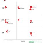
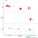
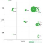
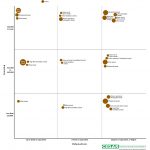
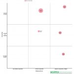
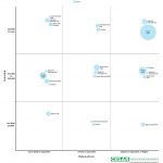
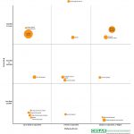
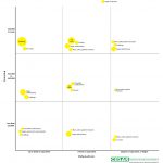
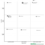
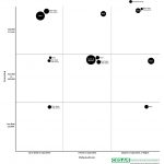
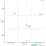
The types and quantities of foods we eat are influenced by our personal characteristics and also our social and economic situations. Income and educational attainment are particularly important in determining dietary behaviour. Using data from the National Diet and Nutrition Survey, we have created a graphic that illustrates how UK food consumption varies for population groups differing in level of income and education against the national average.
Key facts
- Foods appear in this graphic only if they are consumed in quantities significantly greater than that of the UK population as a whole.
- Therefore the foods shown here are those food which stand out on a statistical basis, not the totality of the diet within each demographic group.
- The relative size of each circle indicates how much greater than average each of the foods is eaten. For example, based on this graphic you can say that people with high incomes and degrees have unusually high consumption of game birds compared to the population, but not that they necessarily eat more game birds than they eat beef & veal dishes.
- A more detailed description of the methods can be found under the graphic.
Click on the image to enlarge it, and explore graphics for individual food groups via the images underneath.
Explore by food group
- Meat
- Fish
- Fruit & vegetables
- Grains
- Nuts, seeds & beans
- Dairy
- Fats & high fat starch
- Sugars & desserts
- Drinks
- Alcoholic drinks
- Other/misc
Methods
- The data for this graphic come from years 1-3 of the rolling programme of the National Diet and Nutrition Survey (NDNS). Which contains detailed data about food eaten by 1,491 adults. Because of the way NDNS is conducted, these data are a statistically representative sample of what is eaten by people in the UK.
- For each income-education category, consumption (in grams) was estimated for 68 food, beverage, and nutrient categories, as defined in NDNS.
- The estimation of intake was adjusted for the age and gender make-up of each group and the total quantity of food consumed.
- The group was plotted as a circle within the graphic if its consumption exceeded the 95% upper confidence interval of the population mean.
- The size of the circle is proportional to the difference between the level of consumption within a specific income-education category and that of the population overall.
- Within each square in the grid, similar foodstuffs are clustered together, but otherwise the relative placement of each circle does not have any meaning.
- The income categories use equivalised household income, to account for differently sized households.
Acknowledgements and feedback
- Developed at the UKCRC Centre for Diet and Activity Research, MRC Epidemiology Unit, University of Cambridge. Data analysis by Nick Jones and Pablo Monsivais. Graphic by Oliver Francis using Adobe InDesign.
- Download a pdf of the composite image with explanation of data.
- We would like to develop this graphic by adding more interactive features. If you have any comments or questions, or suggestions for other interactive features, please email Oliver on ocf26@cam.ac.uk.
- The NDNS survey is commissioned by the Food Standards Agency and Department of Health, The data it produces are used for many different purposes and are an important asset for public health research in the UK, since they provides us with a detailed account of what is eaten in a representative sample of people in the UK. The NDNS survey is carried out by MRC Human Nutrition Research and NatCen.
- We took inspiration from a matrix plot published by Bloomberg Businessweek in November 2013, which explored food purchasing in the USA.
반응형
'庫間 > 해외자료' 카테고리의 다른 글
| 다양성 보존을 위한 에티오피아 종자은행의 새로운 접근법 (0) | 2014.03.24 |
|---|---|
| 유전자변형 작물: 유럽의 과학자들이 생명공학을 촉진하고자 아프리카로 내려가다 (0) | 2014.03.24 |
| 미국의 농업 인구조사에서 알 수 있는 다섯 가지 사실 (0) | 2014.03.24 |
| 미국 위스콘신 주의 공개형 씨앗 운동 (0) | 2014.03.24 |
| 쿠바, 상상의 천국 (0) | 2014.03.24 |

